Wayfinding signage isn't just graphic design. It's a compliance requirement with dimensional specs, contrast rules, and mounting heights that carry legal weight. Get it wrong, and you're looking at redesign costs, ADA complaints, or visitors who simply give up and leave.
This manual breaks down the four types of wayfinding signage, the design principles that make systems work, the ADA rules that govern them, and the process that keeps projects from going sideways.
Key Takeaways
- Wayfinding signage falls into four categories: directional, informational, identification, and regulatory
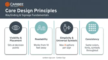
- Effective systems rest on four pillars: visibility, readability, simplicity, and consistency
- ADA compliance governs contrast, character height, tactile elements, and mounting height
- A structured five-step process (assessment through evaluation) prevents costly rework
Understanding Wayfinding Signage: Types and Why It Matters
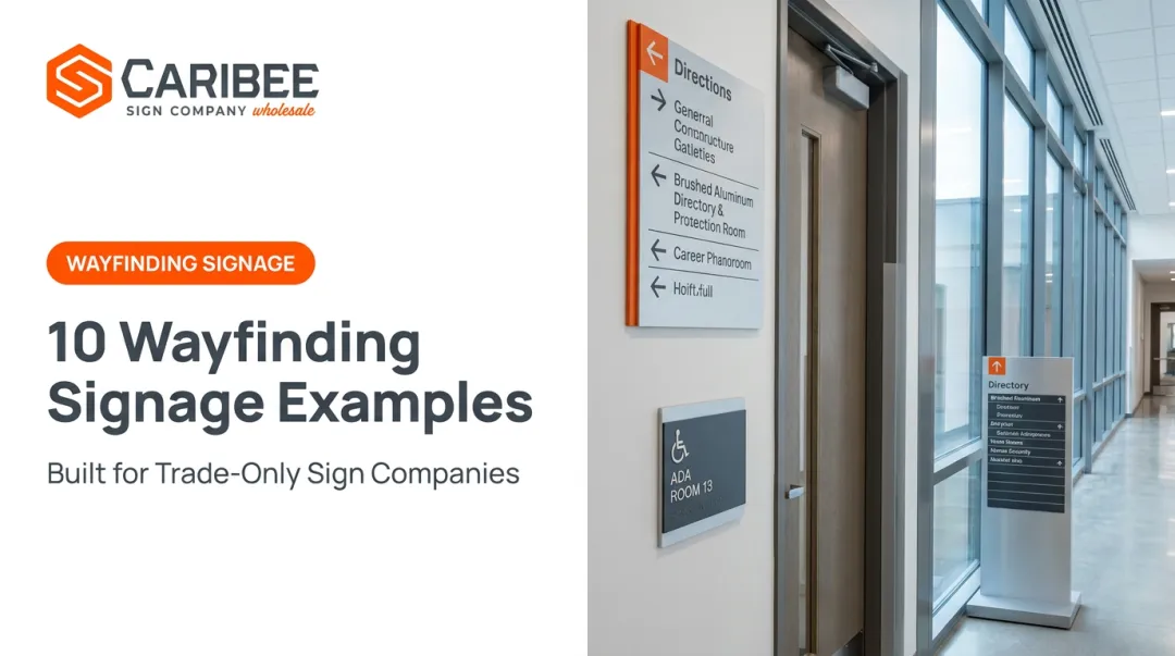
Wayfinding signage is a system of signs that guides people through a physical space: a hospital, campus, office building, or retail center. It functions as a navigation tool and a safety mechanism, while doubling as a brand touchpoint.
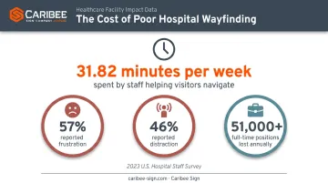
The stakes are higher than most facility managers realize. A 2023 survey of 301 U.S. hospital staff found employees spent an average of 31.82 minutes per week helping people navigate the building, with 57% reporting frustration and 46% reporting distraction tied directly to poor signage. Extrapolated across the industry, researchers estimated the equivalent of over 51,000 full-time positions lost annually to navigation assistance alone.
Solving that problem starts with getting the sign types right. Facility wayfinding systems break down into four distinct categories, each doing a different job.
Directional Signage
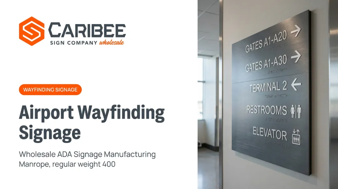
Directional signs point users toward a destination, such as exits, parking, departments, or restrooms. They live at decision points: hallway intersections, lobby entrances, elevator banks. Miss a decision point, and the whole system breaks down, no matter how good the individual signs look.
Informational Signage
Informational signage covers directories, maps, and posted rules. It doesn't tell someone where to turn; it gives context so they can make their own decision. A hospital lobby directory or a campus map kiosk both fall into this category.
Identification Signage
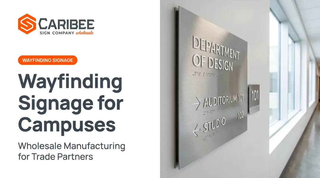
Identification signs label a specific room or area: "Room 204," "Radiology," "Human Resources." These must be concise and readable at a glance, and under ADA Section 216.2, permanent room and space identification signs carry specific tactile and Braille requirements, meaning identification signage is where compliance scrutiny is often the tightest.
Regulatory Signage
Regulatory signage communicates legal or safety obligations: fire exit markers, accessible parking designations, occupancy limits. These signs tie directly into code compliance, and getting the specs wrong here creates the most direct liability exposure for a facility owner.
Core Design Principles for Effective Wayfinding Signage
Before finalizing any sign system, every sign company should apply four core principles. Skip one, and the whole system underperforms, even if individual signs are technically correct.
Visibility and Placement
Signs need to sit at decision points, within sightlines for both standing adults and wheelchair users. The Center for Health Design's progressive-disclosure model recommends guiding users from one decision point to the next, not communicating an entire route on a single sign.
Readability
Font choice, sizing, and contrast determine whether a sign works from ten feet away or only from three. ADA visual character rules require conventional letterforms, a non-glare finish, and light-on-dark or dark-on-light contrast, though there's no numeric contrast ratio specified, unlike digital accessibility standards.
Simplicity and Universal Symbols
Concise messaging beats comprehensive messaging. Design guidance from the Center for Health Design recommends no more than three directional options per sign. Beyond that, users start skimming past the information instead of using it. Pairing text with ISO 7001-standardized pictograms helps non-English speakers and reduces cognitive load for everyone.
Consistency
A standardized design language (the same colors, fonts, and symbol set across every sign in a building) builds trust fast. Once a visitor learns what a directional sign looks like in your system, they'll recognize it instantly at the next intersection. Inconsistent systems force users to re-learn the logic at every turn.
ADA Compliance: The Non-Negotiable Standard for Wayfinding Signage
ADA compliance is federal law, and the specifications are exact. The 2010 ADA Standards for Accessible Design lay out requirements that touch nearly every dimension of a sign:
| Requirement | Specification |
|---|---|
| Tactile character height | 5/8 inch to 2 inches, raised at least 1/32 inch |
| Braille | Contracted Grade 2, domed dots, placed below tactile text |
| Mounting height | Baseline between 48 and 60 inches above the floor |
| Visual character contrast | Non-glare finish, light-on-dark or dark-on-light (no numeric ratio specified) |
| Pictogram field | Minimum 6 inches high, with tactile text descriptor below |
Enforcement carries real legal consequences. In a 2020 Department of Justice settlement, a Connecticut hotel was required to add accessible-entrance directional signs, compliant parking identification, and tactile exit signage after failing to meet these standards. No damages were assessed, but the corrective mandate alone meant a full signage overhaul on the hotel's dime.
Sign companies face a genuine tension here: clients want signage that reflects their brand, but every identification and regulatory sign has to hit exact ADA specs regardless of aesthetic preference. There's no negotiating tactile character height for the sake of a logo.
Exterior wayfinding adds another layer. The 2023 MUTCD update permits non-standard lettering on community-wayfinding signs, but only when an engineering study proves the alternative is equally legible. Decorative, script, or italic fonts are still prohibited outright. Community-wayfinding guide signs must also remain rectangular in shape. It's flexibility with strings attached.
This is where a manufacturing partner matters. Caribee Sign has spent over 60 years producing ADA-compliant signage for sign companies nationwide, handling Braille translation in-house so partners don't have to source it separately. That takes one specialized, compliance-critical step off a sign company's plate, reducing the chance of a spec getting missed before it ever reaches a customer's building.
The Wayfinding Signage Design Process
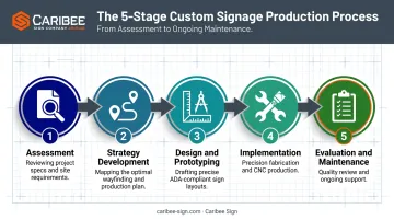
A structured process keeps wayfinding projects from turning into expensive do-overs. Five phases cover the full lifecycle:
- Assessment — Conduct a site analysis and evaluate user needs, including accessibility requirements, before any design work starts. This is where you catch the decision points that will need signage later.
- Strategy Development — Map out key decision points and build a content hierarchy so critical navigation information never gets buried under secondary details.
- Design and Prototyping — Build a cohesive sign family: consistent shapes, colors, fonts, and icons. Test prototypes for real-world clarity before committing to full production.
- Implementation — Manufacture and install the signage. Partnering with an experienced ADA-compliant fabricator helps ensure every spec — character height, Braille placement, contrast — is met the first time, not caught in a post-install audit.
- Evaluation and Maintenance — Schedule periodic audits to catch outdated, damaged, or non-compliant signage before it becomes a liability. Layout changes, rebranding, and code updates all trigger the need for a fresh look.
Why implementation is where projects usually stall: a design can look perfect on paper and still fail production if the fabricator doesn't have the tooling to hit tactile depth or Braille dot spacing consistently.
Caribee Sign runs full in-house production — CNC routing, laser engraving, and precision fabrication — so sign company partners aren't juggling multiple vendors to get one compliant sign family out the door.
Common Wayfinding Signage Mistakes to Avoid
Even experienced sign companies run into the same recurring problems. Watch for these four:
- Information overload: Cramming too much text or too many directional options onto one sign overwhelms users instead of guiding them. Stick to the three-option rule at any single decision point.
- Neglected accessibility features: Skipping Braille, using insufficient contrast, or mounting signs outside the 48–60 inch baseline range creates immediate ADA compliance gaps.
- Inconsistent design: Mixing fonts, colors, or terminology across a building confuses users and dilutes the client's brand identity at the same time.
- Poor placement: Signs mounted too high, too low, or obscured behind doors and fixtures fail at their one job, regardless of how well-designed they are.
One real-world audit of a public library's signage revealed this exact pattern. Multiple signs repeated the same information, each added at a different time, with no consistent branding or terminology, resulting in a system that grew instead of one that was designed.
Frequently Asked Questions
What is the difference between wayfinding signage and regular signage?
Wayfinding signage specifically guides movement through a space using directional, informational, identification, and regulatory cues. General signage, like advertising or branding displays, doesn't serve a navigational function.
What are the four main types of wayfinding signage?
The four main types are:
- Directional signs pointing to destinations, like exit signs
- Informational signs providing context, like directories
- Identification signs labeling spaces, like room numbers
- Regulatory signs communicating legal requirements, like fire exit markers
How does ADA compliance affect wayfinding signage design?
ADA compliance dictates font size, contrast, tactile and Braille elements, and mounting height. Design teams should build these specs into the design from day one rather than adjust them after the fact.
How often should wayfinding signage be updated?
Update signage after layout changes, rebranding, or code updates. Beyond that, schedule periodic audits to catch worn, damaged, or outdated signs before they cause confusion or compliance issues.
What materials work best for outdoor wayfinding signage?
Durable, weather-resistant options like aluminum, HDU, and UV-stabilized plastics hold up best outdoors. The right choice depends on climate exposure, budget, and the aesthetic the project calls for.
How can sign companies ensure ADA compliance when producing custom wayfinding signs?
Partnering with a specialized ADA-compliant manufacturer, like Caribee Sign, helps sign companies meet regulatory specs reliably without slowing down production timelines or adding extra vendors to the process.