Yet many sign companies and business owners still struggle with the fine print: exact dot spacing, mounting height windows, braille grade rules. Miss one spec and you risk failed inspections, costly retrofits, or worse, a lawsuit.
This guide breaks down every core ADA braille signage requirement, from braille dot dimensions to mounting placement, so you can order or fabricate signage that passes inspection the first time.
Key Takeaways
- Grade 2 braille is mandatory; Unified English Braille (UEB) satisfies this requirement
- Tactile characters must sit 48–60 inches above finished floor, measured to baseline
- Braille needs 3/8-inch minimum separation from raised text and borders
- Not every sign needs braille: directories, menus, and temporary signs are exempt
- Contrast rules don't apply to braille dots since they're read by touch, not sight
Why ADA Braille Signage Compliance Matters
Title III of the ADA requires braille and tactile signage at permanent rooms, exits, and other specified locations. This is federal law, codified at 28 CFR 36.406, which applies the 2010 ADA Standards for Accessible Design to new construction and alterations.
These requirements exist for a reason that goes beyond paperwork. For someone who is blind or has low vision, a compliant sign is the difference between confidently finding a restroom or exit and wandering a hallway asking strangers for help. Those are the human stakes behind these specifications.
The business risk is real too. Federal courts saw 8,667 Title III lawsuit filings in 2025 alone, down only slightly from 8,800 in 2024, according to Seyfarth Shaw's ADA Title III tracking. That figure covers all Title III claims, not signage specifically, but it shows how active this litigation landscape remains.
Non-compliant signage can trigger:
- Formal DOJ complaints
- Private lawsuits from advocacy groups or individuals
- Forced retrofits mid-lease or mid-renovation
- Failed local building inspections that delay occupancy
Getting the specs right the first time costs far less than fixing them after the fact.
Core ADA Braille Specifications
Braille requirements are precise down to fractions of an inch. Here's what the 2010 ADA Standards, Section 703.3, actually require.
Braille Grade and Dot Dimensions
ADA-compliant signage must use contracted (Grade 2) braille, the standard system used across the U.S. Uncontracted Grade 1 braille doesn't meet code. The Access Board confirms that Unified English Braille (UEB) satisfies the Grade 2 requirement, so signage using UEB is fully acceptable.
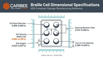
Dot shape and spacing tolerances are tight:
| Element | Specification |
|---|---|
| Dot shape | Domed or rounded |
| Dot base diameter | 0.059-0.063 in. |
| Dot height | 0.025-0.037 in. |
| Dot spacing within a cell | 0.090-0.100 in. |
| Dot spacing between cells | 0.241-0.300 in. |
| Line-to-line spacing | 0.395-0.400 in. |
Positioning, Spacing, and Capitalization
Braille must sit below the corresponding raised text. If text spans multiple lines, braille goes below the entire block, not interspersed between lines.
A few more rules worth memorizing:
- Minimum separation: 3/8 inch between braille and any raised characters, borders, or decorative elements (elevator car controls get a 3/16-inch exception)
- Capitalization: Limited to the first word of sentences, proper nouns, individual letters, initials, and acronyms, even when the visual text above is all uppercase
- Finish and contrast: Braille dots are exempt from these rules entirely since they're read by touch
That last point trips up a lot of first-time fabricators. You can spend hours matching paint finishes to contrast ratios for visual characters and skip that step completely for the braille dots themselves.
Tactile Character Requirements
Raised characters carry their own set of rules, separate from braille, while working alongside it on the same sign.
Height, Proportion, and Stroke Thickness
Character height, measured on the uppercase "I," must fall between 5/8 inch and 2 inches. There's an exception: if separate compliant visual characters are provided elsewhere on the sign, the tactile minimum drops to 1/2 inch.
Proportions matter too:
- Width-to-height ratio: The uppercase "O" must be 55%-110% of the height of the uppercase "I"
- Stroke thickness: Maximum 15% of the character height
- Raised depth: At least 1/32 inch above the background surface
Style, Spacing, and Contrast
Characters must be uppercase and sans serif. No italics, no script, no decorative flourishes, no exceptions. This keeps tactile reading accurate for fingertips scanning quickly across a wall-mounted sign.
Spacing rules protect legibility:
- Character spacing measured between closest points of adjacent characters (word spaces excluded)
- Line spacing set at 135%-170% of the raised character height, baseline to baseline
- Raised characters need at least 3/8 inch of separation from raised borders
Finish and contrast requirements apply here, unlike braille. Signs need a non-glare finish with either light-on-dark or dark-on-light contrast between characters and background.
This rule applies directly when a sign's tactile content doubles as its visual content. When separate compliant visual characters exist elsewhere, the tactile content is off the hook for finish and contrast.
Sign Placement & Mounting Guidelines
Getting the sign itself right means nothing if it's mounted incorrectly. Placement rules exist so a person navigating by touch can predict where signage will be, building after building.
Mounting Height and Door Placement
Tactile characters must be mounted so the baseline of the lowest character sits at least 48 inches above finished floor, and the baseline of the highest character sits no more than 60 inches above finished floor. This is measured to the character baseline, not the sign's edge.
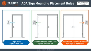
Door-side placement follows three scenarios:
- Single door: Mount the sign on the latch side of the door
- Double doors, one active leaf: Mount on the inactive leaf
- Double doors, two active leaves: Mount to the right of the right-hand door; if that wall space isn't available, use the nearest adjacent wall
Clear Floor Space and Consistency
Every sign needs an 18-inch by 18-inch clear floor space, centered on the tactile characters, positioned outside the door's swing arc from closed through 45 degrees open. One exception: a tactile sign can sit on the push side of a door if that door has a closer and no hold-open device.
This consistency pays off for repeat visitors, who learn to locate signage by touch without hesitation once mounting height and door-side placement stay fixed from the lobby to the loading dock.
Special cases deviate slightly from standard rules:
| Location | Key Difference |
|---|---|
| Elevator hoistways | Tactile floor designations required on both jambs; minimum 2-inch character height |
| Elevator car controls | Braille/raised text placed immediately left of buttons; exempt from standard mounting height |
| Exit stairwells | Standard 703.4 mounting and door-side rules apply |
| Areas of refuge | Permanent-space ID signs need tactile treatment; egress-direction signs typically need only visual compliance |
Which Signs Require Braille (and Which Don't)
Not every sign in a building needs braille. Knowing the difference saves fabrication time and cost.
Signs that require tactile and braille treatment:
- Permanent room and space designations (offices, conference rooms, storage)
- Restroom identification signs
- Exit stairwell, exit passageway, and exit discharge door signs
- Elevator hoistway floor designations and car controls
Signs exempt from tactile and braille treatment:
- Temporary signs posted 7 days or less
- Building directories
- Occupant names, company logos, and building addresses
- Menus and seat/row designations
Purely directional or informational signage—restroom arrows, hours-of-operation postings, rules-of-conduct notices—must meet visual character requirements under Section 703.5. They don't need braille because they're pointing the way rather than identifying a permanent space.
Choosing the Right ADA Signage Partner
Even with every spec memorized, fabricating braille signage that consistently hits ADA tolerances takes specialized equipment and repeated production experience. A single missed dot height or an eighth-inch mounting error can mean a failed inspection.
That's the gap a dedicated manufacturing partner fills. Working with a trade-only ADA sign manufacturer reduces liability for sign companies and gives them one less variable to manage on every project.
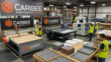
Caribee Sign has operated as a trade-only wholesale manufacturer for more than 60 years, producing custom ADA signage exclusively for sign companies and visual communication firms, not direct-to-consumer. That wholesale focus means the entire operation is built around one thing: turning out compliant, consistent signage order after order.
Hugh Welch of Hugh-Carolina Sign Co. put it plainly in a recent testimonial:
"They're our 'go-to' company for all of our ADA signage needs. They're easy to work with, super responsive, provide excellent customer service, and deliver high-quality products that meet all requirements."
That kind of repeat, trust-based relationship is what a wholesale partnership should look like. Sign companies get to focus on design, client relationships, and installation, while the compliance details (braille grade, dot spacing, mounting math) get handled reliably behind the scenes.
If you're a sign company juggling multiple ADA projects at once, a manufacturing partner with decades of specialized production experience is worth more than trying to verify every spec in-house on every order.
Frequently Asked Questions
Is braille required for all ADA-compliant signage?
No. Braille is only required on tactile signs identifying permanent rooms, spaces, exits, and elevators. Directories, temporary signs, and purely directional signage don't need it.
What is Grade 2 braille and why is it required?
Grade 2, or contracted braille, is the standard system used throughout the U.S. for accessible signage. Unified English Braille (UEB) meets this requirement according to the Access Board.
How high should ADA braille signs be mounted?
Tactile character baselines must sit between 48 and 60 inches above the finished floor. This range keeps signage within a predictable reach zone for people navigating by touch.
What is the required spacing between braille and raised text?
Braille needs at least 3/8 inch of separation from raised characters, borders, or decorative elements. Elevator car controls have a smaller 3/16-inch minimum.
Do braille signs need to have high contrast?
No. Contrast and non-glare finish rules apply to raised, visual characters, not braille dots. Braille is read by touch, so visual contrast has no bearing on compliance.
Where should ADA braille signs be placed at doorways?
Placement depends on the door configuration:
- Single doors: mount on the latch side
- Double doors with one active leaf: mount on the inactive leaf
- Double doors with two active leaves: mount to the right of the right-hand door