The trouble is, the specifications are precise and unforgiving. Character height, stroke width, braille dot geometry, mounting position, all of it is exact. Get one measurement wrong, and you're facing re-fabrication costs, a frustrated client, or a compliance complaint. Many sign companies and businesses find themselves genuinely confused about where the requirements start and stop.
This guide breaks down what the 2010 ADA Standards actually require, how solid wayfinding design ties into those specs, and what to look for in a manufacturing partner who gets it right the first time.
Key Takeaways
- ADA mandates exact tactile character size, spacing, braille format, and placement
- Effective wayfinding depends on four sign types working together, not braille alone
- Fabrication method, whether routed or press-fit, affects durability and legal exposure
- A responsive, experienced partner keeps compliance simple, not a research project
ADA Requirements: Specs You Can't Ignore
"Tactile" and "braille" get used interchangeably, but they're two separate elements. Tactile signage means raised uppercase letters and pictograms that visitors read by touch. Braille signage is the raised dot system that trained readers interpret directly.
Under the 2010 ADA Standards, Section 703, most permanent room and space identification signs need both: raised characters duplicated in braille positioned below.
Local and state codes sometimes add stricter rules on top of the federal baseline. Confirm those requirements before finalizing any design.
Tactile Character Specifications
- Uppercase, sans-serif lettering only — no italics, script, or decorative fonts
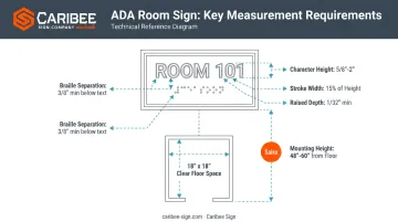
- Character height between 5/8 inch and 2 inches, measured using the uppercase "I"
- Stroke width capped at 15% of character height
- Character spacing of 1/8 inch minimum for rectangular strokes
- Other cross-sections need at least 1/16 inch spacing at the base and 1/8 inch at the top
- Raised depth of 1/32 inch minimum above the background
- A non-glare finish with visible light-on-dark or dark-on-light contrast (the standard sets no numeric percentage, only a visibility requirement)
Braille Specifications
Grade 2, or contracted, braille is mandatory on covered signs. Dots must be domed or rounded, never flat-topped, and braille always sits directly below its corresponding text line.
| Measurement | Federal specification |
|---|---|
| Dot base diameter | 0.059–0.063 inch |
| Dot height | 0.025–0.037 inch |
| Spacing within a cell | 0.090–0.100 inch |
| Spacing between cells | 0.241–0.300 inch |
Braille must also sit at least 3/8 inch from other tactile characters or raised borders. Get this measurement wrong and even perfectly formed dots can fail an inspection.
Placement and Mounting Standards
- Mount tactile baselines between 48 and 60 inches from the floor
- At a single door, mount on the latch side wall
- With double doors and one active leaf, mount on the inactive leaf
- With double doors, both active, mount to the right of the right-hand door
- Leave an 18x18 inch clear floor space in front of the sign, outside the door's swing arc
Understanding Effective Wayfinding Design
Braille and tactile text solve one piece of the puzzle. Wayfinding is the rest of it: the overall system that helps every visitor, sighted or not, move from the entrance to their destination without guessing.
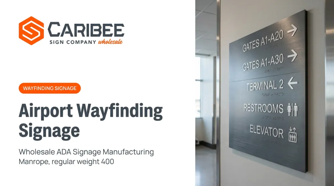
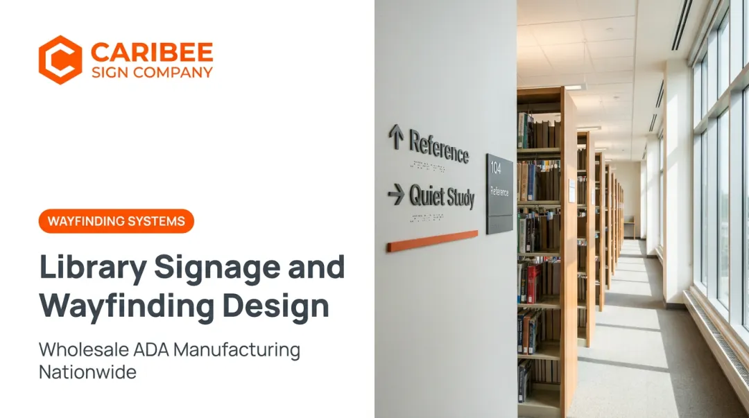
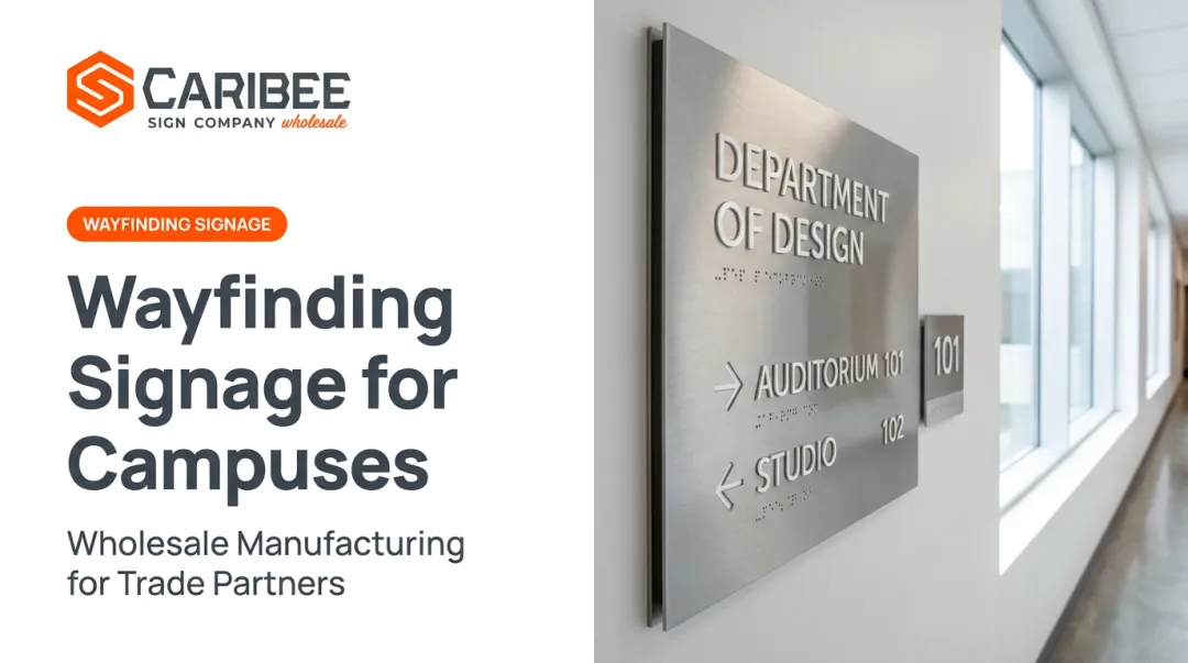
The Four Types of Wayfinding Signage
- Identification signs label a specific room, department, or area, such as "Exam Room 3" or "Records Office"
- Directional signs use arrows and short text to guide people along a route
- Orientation signs, like maps and directories, show the bigger picture so visitors can locate themselves before choosing a path
- Regulatory and informational signs communicate rules, hours, occupancy limits, or restrictions
How People Actually Navigate a Building
Research on wayfinding behavior, including ACRP Report 52 on airport terminals, breaks visitor navigation into a consistent sequence:
- Orientation: figuring out where you currently are
- Route decision: choosing which direction to go
- Route monitoring: checking that you're still headed the right way
- Destination recognition: confirming you've arrived
Strong wayfinding systems support each of those steps with consistent terminology, clear decision-point signage, and minimal visual clutter. For a visitor who is blind, tactile and braille elements have to deliver that same confirmation at every stage, not just at the front door.
A braille directory at the entrance means little if the exam room signs further down the hall skip tactile copy entirely. Consistency across the whole path is what makes a building navigable, not a single well-designed sign.
Why Craftsmanship and Material Quality Matter
Not every ADA sign is built the same way, even when the dimensions match the standard on paper.
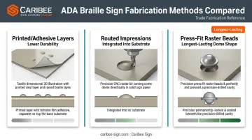
- Printed or adhesive raised layers can peel, flatten, or wear smooth after repeated contact, which is exactly the failure mode that makes a sign unreadable
- Routed impressions cut the tactile copy directly into the substrate, so the raised element is part of the material rather than something glued on top
- Press-fit raster beads set each braille dot individually, producing consistent, precisely domed dots that hold their shape for years
The legal stakes back this up. Federal ADA Title III lawsuits climbed to 8,800 in 2024, up from 8,227 the year before, according to Seyfarth Shaw's annual review.
That figure covers Title III litigation broadly, not signage cases specifically, but it shows accessibility complaints aren't slowing down. A sign that fails an inspection or a complaint review gets expensive fast, especially if it needs replacing across dozens of locations.
Avoiding that expense doesn't mean sacrificing design, though. Custom acrylic substrates, colors, and finish options let braille and tactile signage match a brand's look while keeping every dimension within tolerance.
Where This Signage Is Used
ADA coverage is broad, and each sector brings its own pressure points.
- Healthcare facilities need accuracy above all else, since patients navigating exam rooms and departments under stress can't afford a misread sign adding friction to an already difficult visit.
- Hospitality, retail, and corporate environments balance strict compliance with brand identity, since signage is often a guest's first impression.
- Government, education, and public buildings fall under broad ADA mandates that apply to nearly every space, from classrooms to administrative offices.
Across all three, the underlying requirement doesn't change. What changes is how much the sign has to do beyond compliance, whether that's guiding a nervous patient or reinforcing a hotel's brand.
Partnering with a Reliable ADA Signage Manufacturer
For sign companies, the real challenge is finding a manufacturing partner who can hit those specifications consistently, order after order, without turning every project into a back-and-forth.
What to look for in a manufacturing partner:
- Responsiveness — quick quote turnaround and clear communication when questions come up mid-project
- Consistent product quality — the same tactile clarity and braille accuracy whether it's sign one or sign fifty
- A straightforward ordering process — simple quote-to-production steps that don't require guesswork
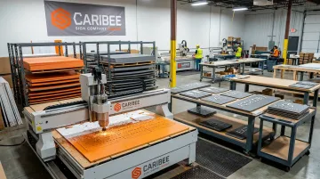
Caribee Sign has built its wholesale model around exactly that. Every order is produced in-house at its St. Louis facility using CNC routing and precision fabrication, so tactile and braille elements come out the same way whether a sign company orders five signs or five hundred.
Quote requests typically get a response within one business day, and Caribee's Order Processing Guide and ADA Compliance Guidelines help partners submit accurate specs the first time.
That consistency matters most on recurring work. A multi-location rollout for a hospital system or retail chain needs every site to match, in material, finish, and compliance, without the sign company managing quality control site by site. A single, dependable production partner solves that problem once instead of fifty times.
Ready to simplify your next ADA signage order? Connect with Caribee Sign to get a wholesale quote started.
Frequently Asked Questions
Do wayfinding signs need braille?
Signs identifying permanent rooms and spaces generally require braille alongside tactile characters under Section 703. Purely directional signs, by contrast, are governed by visual-character rules and don't automatically require braille.
Is braille still used today?
Yes. Braille remains legally required on ADA signage and essential to literacy for blind readers, even as digital accessibility tools expand. The two complement each other.
What are the 4 types of wayfinding signs?
Identification signs label specific rooms or areas, directional signs guide people along a route, orientation signs like maps show the bigger picture, and regulatory/informational signs communicate rules or restrictions.
What are the core principles of effective wayfinding?
Visitors move through a building by orienting themselves, deciding on a route, monitoring their progress, and confirming they've arrived. Good signage supports each of these steps with consistency and clear decision-point information.
What is the difference between tactile and braille signage?
Tactile signage uses raised uppercase letters and pictograms read by touch, while braille uses a raised dot system for trained readers. ADA-compliant signs typically need both elements together.
How can a business make sure its signage stays ADA-compliant over time?
Schedule periodic audits to catch worn or damaged tactile elements, work with a manufacturer who understands current federal and local codes, and replace signage promptly when materials degrade.